
Marko Stanić
Software Engineer
Blog: Fast Lightmapping in Grid-Based Worlds
Lighting is the integral part of almost any visual media, be it a photograph, a movie, a theatre play or a video game. Just like the dialogue or the music, it sets the mood and tells a story. However, sometimes it's hard to get it right.
Worship is a small C++ game I've been writing in my spare time for a while now, and I've decided to experiment with the lighting algorithm to see what I can come up with. I've summarized the process here in case someone needs to implement something similar.
The Problem
To keep things simple, we'll focus on the most relevant aspects. Here's what we got:
- grid-based world, each cell occupies a fixed amount of space
- cells can be opaque (e.g. walls) or transparent (e.g. air)
Let's make a small level to demonstrate our problem. It's just some walls, the player and an armor pickup.
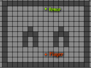 Example level layout.
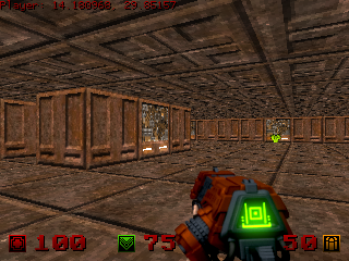 Example level without lighting.
Looks kind of dull, doesn't it? Depth perception suffers a bit as well, since it's hard to discern whether we're looking at the near or the far wall, unless we really focus.
Maybe we can make something work by applying some fog. This can be done in a variety of ways. For example, in the vertex shader:
float distance = length(viewSpacePosition);
float fogFactor = clamp(1.0 /exp(distance * uniformFogDensity), 0.0, 1.0);
...
outFragColor.rgb *= fogFactor;
The result is not perfect, however.
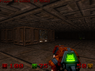 Example level with fog.
Depth perception seems improved, but still looks a bit dull and way too dark. Also, with fog, we're limiting the view distance, which would most definitely frustrate the player.
Remember the armor pickup? The player should be aware that this pickup is a point of interest as soon as they enter the room. In the scenario where there is no fog, there's a pretty decent chance the player would just overlook it since it doesn't really stand out in relation to the environment. Sure, the sprite is there, it's plainly visible, but it doesn't pop. On the other hand, with fog enabled, the player may not even see the pickup due to the reduced view distance. The fog density is adjustable, but the thinner the fog, the more depth perception we lose.
So what can we do to make this look better? What if we throw the fog out, make the entire world darker and then use lights sparingly to mark points of interest?
Turning on the Lights
Note: Images below may appear darker than they are due to the white background.
If we try to perform classic per-vertex lighting, at first, the results may seem pretty decent.
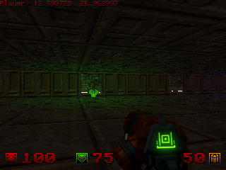 Per-vertex GLSL lighting.
However, we soon realize it falls rather short. Consider the scenario in which the light source is behind a wall. Since we're not doing any shadow casting, the light simply bleeds through and shows up on the floor and the ceiling.
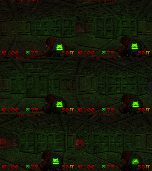 Light bleed-through.
We could implement shadow mapping, but it's really an overkill for a simplistic game like this. We have the luxury of a static world and fixed, tile-based layout, and we can use that to our advantage. What if we could cheaply approximate the way the light travels and bounces off nearby surfaces, then bake the light information into the tilemap?
If you take out a tube of toilet paper and a lighter, and shine the lighter at the one end, you can see that the light attenuates over the way to the other end, but isn't really visible outside, other than near the openings. This is the effect we want.
The Fake Radiosity Algorithm
Since our map is tile-based where every tile occupies a fixed amount of space, this is a pretty good hint to use cellular automata.
The proposed algorithm is as follows: we start at the cell which houses the light source and add it to the queue with light level L. Then we check the cells to the north, south, east and west of the cell. For each of these neighbouring cells, we check if they are transparent (not walls). If the cell is transparent, we add it to the queue, but with light level L-1. Finally, we add the starting cell to the visited set and repeat the process with each of the adjecent cells. Light level L is abstract here, but in most cases, a 3D vector would be suitable, since light would have red, green and blue components.
The effect is visible below.
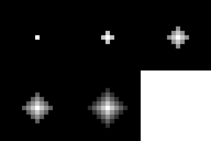 Light spread without obstacles.
 Light spread with some obstacles.
 Light spread with more obstacles.
Since we're using 3D vectors for storing light levels, light interference becomes just a matter of adding the two light levels together and optionally clamping them.
We're almost there. However, you'll notice something weird with the result.
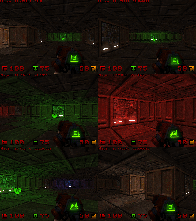 Blocky light level appearance.
In order to get smooth lighting, we're gonna have to store the light values per vertex, rather than just using the tile light levels. To calculate the light level of a vertex, we need to find all the tiles surrounding it and average their light levels - this not only gives us a neat smooth lighting effect, but also free ambient occlusion since our walls have light levels of zero.
There's also the matter of light affecting entities. So far, the entities were only affected by the light level of the cell they were occupying. If you look more closely to the animation above, you can notice how the player's weapon "snaps" between different light levels when moving. We don't want that - we want these transitions to be smooth.
To resolve this, we can use bilinear interpolation. For each given entity position, we can calculate the light level by finding the current tile corners and interpolating between their light levels based on entity position in relation to the tile. For example, if the entity is in the northwest corner of the tile, the relative position is (0.0, 0.0). If the entity is in the middle of the tile, the relative position is (0.5, 0.5).
To interpolate, first perform linear interpolation between the north corners by horizontal component of the relative position to get the north interpolated light level, and then perform linear interpolation between the south corners to get the south interpolated light level. Then, perform linear interpolation between these two light levels by the vertical component of the relative position to get the final entity light level.
This results in smooth lighting with no visible snapping.
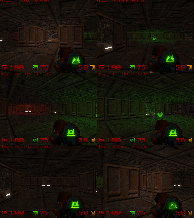 Silky smooth lighting.
Conclusion
While this particular approach works for my use-case, there is no silver bullet here. There are methods which achieve far better results at the cost of additional computational and development complexity. However, since I'm aiming for the retro feel with Worship, this seems good enough, especially when paired with bloom and emission maps.
I hope you found this interesting. There will be more articles as the game draws closer to completion. As usual, I'll publish the source code once it's done on my GitHub profile.
If you have any questions, you can tweet me @Sklopec.


